how to hang art

{an irregular series inspired by my love for creating beautiful spaces, also known as interior design: volume 2}
Just for fun, I thought we would talk about hanging art.
Creating beautiful spaces, also known as interior design, is one of my many loves. I can spend hours thinking about how to arrange a few carefully chosen items on a coffee table, or about where to hang a piece of art. I also trust my design sense. I suspect there are other people who see this sort of thing as a chore or who don’t trust theirs.
I will preface this by saying that in all things, your taste and choice prevails. Whether everyone (or anyone) else agrees with it or not.
Today’s tip: A great rule of thumb is to hang your art at eye level.
There is usually a midpoint or a focal point in the piece. Your piece can be quite arresting when you hang it so that point is at eye level.
Your eye is going to be drawn to the focal point anyway. When it’s the first thing you see – because you don’t have to look up or down to get to it – it pulls you right in.
On a similar note, too low is often better than too high.
Case in point: You can place art on the floor, which looks fantastic.
This is especially true when you are hanging a piece of art or a series above a piece of furniture (like a bed or a couch or a dining room table). It usually works better when the piece or the series is closer to the piece of furniture than it is to the ceiling.
I’ve been trying to decide why this is so and I think it’s because the furniture and the art are meant to complement each other so too much distance can cause confusion. It might also be because the art is usually viewed from that piece of furniture, meaning you are not standing.
Of course, there are exceptions to this, like art on multi-story walls, but in those cases, you are often using the art to draw the eye upward or to accentuate the height of the space.
Feel free to disagree or discuss. I’d love to hear from you.
And if you are ever stuck on where or how to hang something and you want some suggestions, you are welcome to email me pictures and ask for ideas.
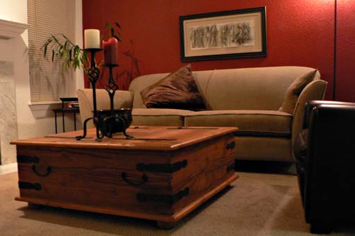
(This is a horrible picture. It looks like my candlestick has green plant wings. But it was the last time I had a wall behind the couch to hang a piece of art on. And oh, I miss that red wall. Also, I miss that bamboo plant. That was one of the few plants that survived my care for any length of time.)
- Filed under
- tips and tricks


VERY fun topic, Elizabeth! And I like the photo–nice to see your space. I love the crimson-painted wall and touches of black–very stylish. It’s tricky hanging art sometimes, especially if the item has an unusual shape. We have a framed print we love that is long and rather narrow, hanging it slightly lower that usual made it work on the wall. Interesting! Happy Days ((HUGS))
Unusual shaped pieces are always an interesting challenge! I’m glad you found the perfect way to hang yours.
one of my very best loves too… design.
all design. but especially interiors.
i actually attended school for it and have a certificate. could practice. but don’t.
i learned much much MUCH more by reading and looking at the best magazines. and studying the old masters of it. and as you say trusting my own ‘eye.’
the picture above of your once place is lovely! i also have a black thumb. LOL.
i love eclectic throwaway elegance… mixed with rustic. you know it when you see it. it’s not ‘placed.’ could talk this all day!
too bad we can’t drive into portland and share a pickle sandwich lunch! LOL …
and a place where atlas would be welcome too of course!
Oh my gosh, yes, I could talk about it all day too. I like to look at interiors in magazines and blogs and I think about it all the time. How fun to go to school for it. I know what you mean by eclectic throwaway elegance. I tend toward a mix of modern, contemporary, Scandinavian, and Asian.